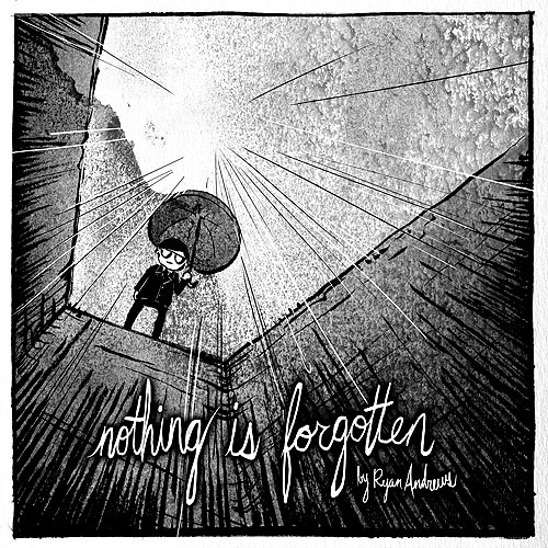
A few people asked to see my process on my short story
Nothing is Forgotten, so I thought I'd try to explain as best I can how I did it. Its always a bit strange showing my workflow though, cause it feels like I'll be found out for cheating. I can imagine the sigh of disappointment "oh...that's how he did it? meh."
I spent a good deal of time sketching out the whole story in my sketchbook. I try to keep my thumbnails as small as I can possibly draw them. These are for me to understand, so they can be super tiny. Probably even smaller than I did them here.
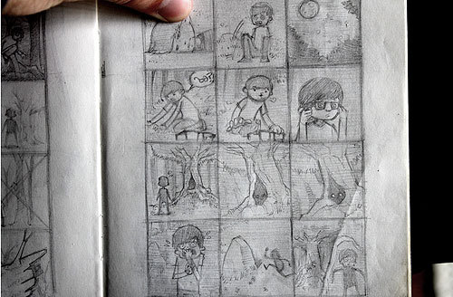
Once I've got the whole thing figured out (I think that's the most important part), I just copy my thumbnails onto a bigger piece of paper, and make 'em look a little prettier.
So, my materials! There aren't many!
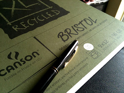
Bristol board, and my absolute favorite thing in the world, my Kuretake brush pen. This bad boy glides around the paper smooth and easy. On some papers though it looks like garbage. For example it doesn't take well to the paper in moleskin sketchbooks.
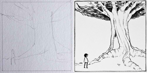
On the bristol board I sketch out the basic layout of the thumbnail in pencil to make sure I have the composition right. I keep this really really simple. I know what it's supposed to be in the end, so it can seriously just be a few lines to give me an idea of placement. Then I just go for it with the ink.
Now the bad thing about this is, when I try to use watercolor on top of this, the ink smears all over the place. I also tend to ruin bristol board when I paint on it with watercolor.
So I do it with the magic of Photoshop.
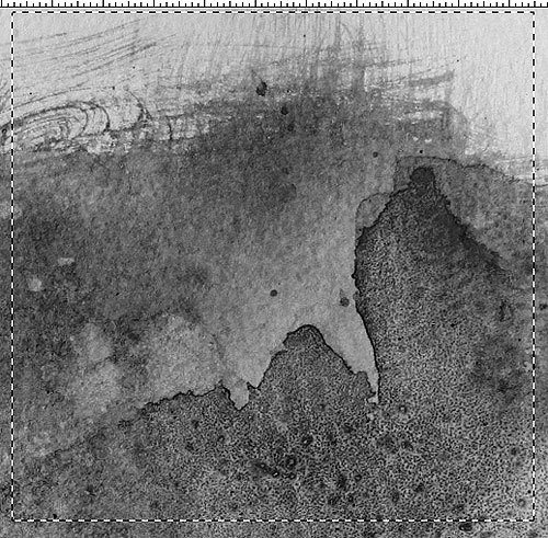
If you're using watercolor to create the background textures, its best to use water color paper. Try different weights, different brands, different presses, they'll all give you different effects.
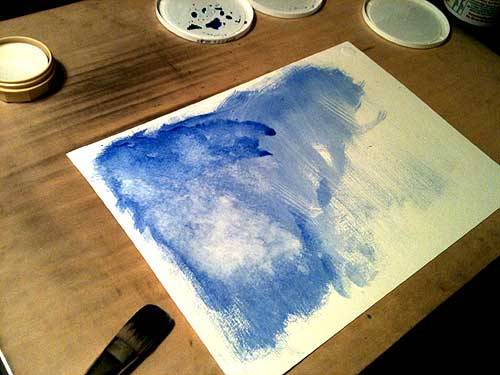
I use Windsor and Newton watercolors, but I suppose any would work fine. I also use yogurt container lids for my palettes so I wouldn't take my advice too seriously.
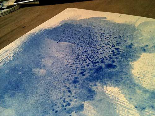
There's no real technique to this. Just experiment. This is actually the most relaxing part of the entire process. Just let go. Use the force. Use rags, salt, whatever brushes you can find laying around.
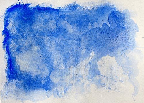
You want to scan this in REALLY high resolution or it'll look like junk against your drawing. If you don't have watercolors, or don't feel like spending the money on all the paper and stuff, you can find lots of awesome watercolor textures online if you search for them. Just make sure you get some good high resolution ones. Make sure you ask the owners before you use them!
Ideally you'll have a lot of these so you can browse through to find the best shapes and textures possible that match your illustration. I think about 20 or 30 would be plenty.
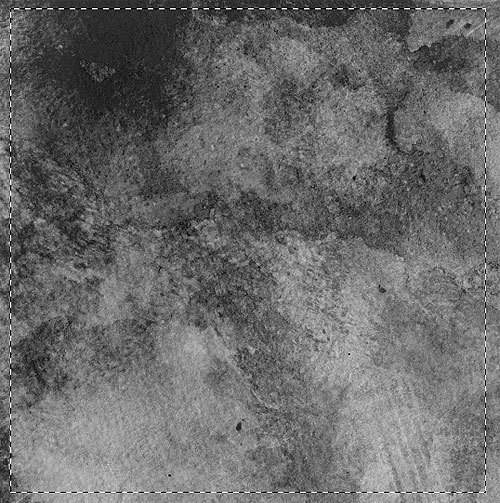
So then you pick out an area that you think looks nice. You drag this onto your scanned in drawing, turn the layer to multiply, and you have THIS:
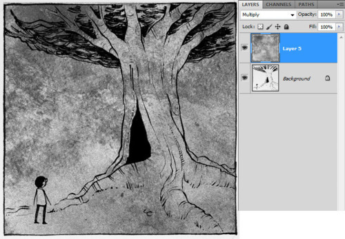
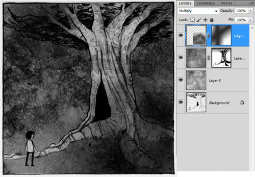
I didn't want the first layer to be too dark so I brightened it a bit with Image > Adjust > Levels. Oh but before you do that, make sure you make a copy of the original layer in case you ever want to go back to it.
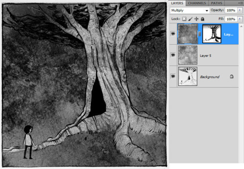
So now I'm going to use that copied layer of the watercolor texture(also set to multiply) to make the tree stand out and make the image overall a little darker cause its supposed to be night. I don't want to just bust out the eraser though and erase the tree, cause then if I want to make corrections later I can't. So I add a layer mask.
Layer > Layer Mask > Reveal all
This allows me to hide parts of the layer by just using the paintbrush.
So I want to add another texture element on the bottom right to make it a bit more shadowy and mysterious.
This'll do.
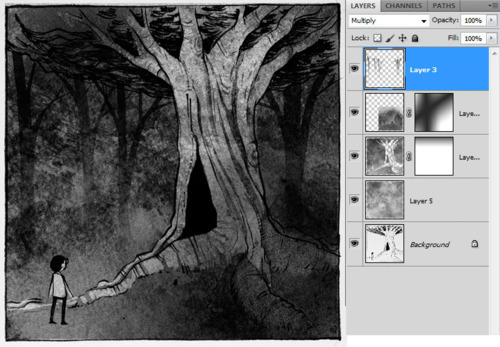
Again using a layer mask with a black gradient to hide the edges of this new addition. It's not much, but it adds a little something.
Next up, my horrible trees (I got a lot better at drawing tree silhouettes as time went on) Don't laugh at them.
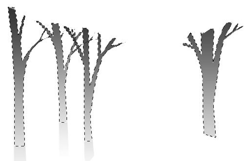
Ok you can laugh. they really are pretty bad. So I drew these trees with the selection tool, and then use a black to transparent gradient on them.
When I put them in the image though they don't look so bad. They're a background element, and just there to give the idea that this is a forest and not just a single tree. I like to think they atleast do that.
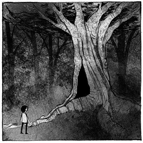
Then you have the final image! Only like a million more to go!
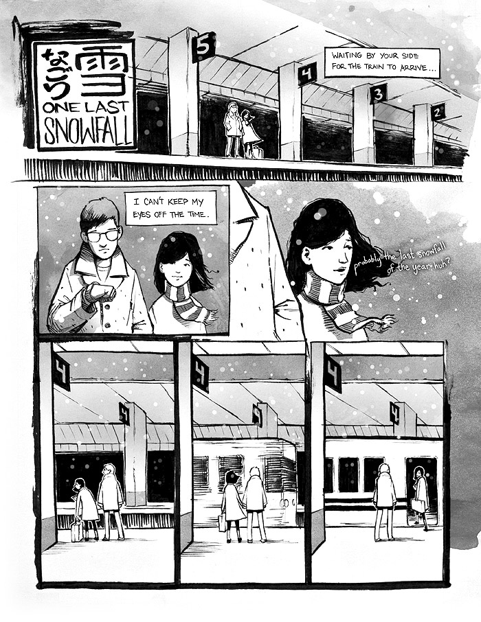
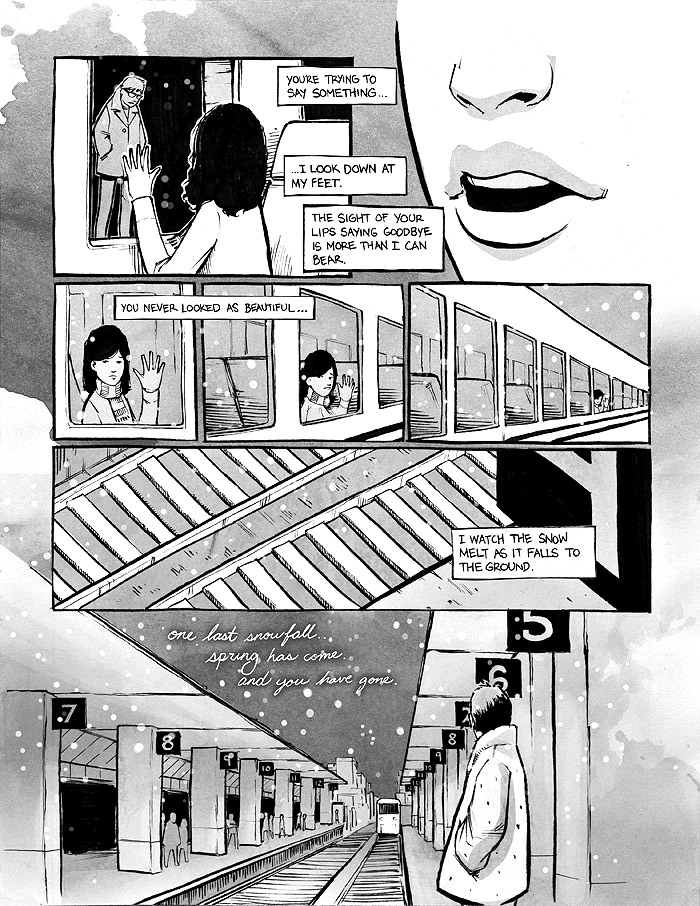
Thank you for reading :) Here's the finished comic,
Nothing is Forgotten.